What is it?
Imagine you’re in a bustling city for the first time, trying to find your way to a specific location. You could have someone explain the directions verbally, listing every turn, landmark, and street name. Or, you could simply look at a map. Which one would you prefer?
In the realm of persuasive messaging, visual representation is about using diagrams, illustrations, infographics, or any other visual elements to convey complex problems or concepts to your readers. It’s about showing, not just telling.

Why is it Important?
We live in a world that’s increasingly visual. Our brains process images 60,000 times faster than text. In fact, 90% of the information transmitted to the brain is visual. When we see an image, it sticks with us. It creates an immediate, emotional connection that words often can’t. Visuals can simplify complex information, make abstract concepts tangible, and make your message more memorable.

How to do it?
Use visuals that support your message: The visuals should not be there just for the sake of being there. They should support your message and make it clearer and more impactful.
Simplify Complexity: Use diagrams or infographics to break down complex ideas into simple, understandable parts. Avoid using overly complicated visuals
Make it engaging: Use colors, shapes, and layouts that are pleasing to the eye. An engaging visual is more likely to grab your reader’s attention.
Use the right type of visual: Different types of information require different types of visuals. For example, data can be represented using graphs or charts, processes can be represented using flowcharts, and concepts can be represented using diagrams or infographics.
Tell a Story: Use visuals to tell a story. This can make your content more engaging and memorable. For example, a timeline infographic can tell the story of how a company or industry has evolved over time.

Create an Emotional Connection: Use visuals that evoke emotion. This can make your content more persuasive. For example, a powerful image can evoke strong emotions that reinforce your message.

Real-world examples:
Let’s take the example of “The You Diagram” from Internet business manifesto
Described in words
The “You” diagram in Rich Schefren’s Internet Business Manifesto visually represents the entrepreneur’s journey and the challenges they face when trying to build a successful online business. He talks about the entrepreneur who’s caught in a never-ending cycle of chasing the next big thing, the next shiny object that promises success. This entrepreneur is constantly busy, but rarely productive. They’re overwhelmed by the sheer volume of tasks, strategies, and tactics they believe they need to master. They’re isolated, feeling like they have to do everything themselves. And they’re frustrated, because despite all their hard work, they’re not seeing the results they want. It’s a maddening, exhausting existence, and it’s not sustainable.
The Actual Diagram
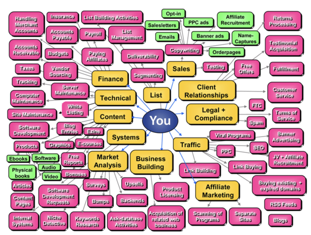
Which one could you relate more with the words written or the diagram itself?